Invisible Man (1952) by Ralph Ellison is a classic award winning American novel which tells the story of a nameless black man set in the 1930s South and the physical and psychological effects of the intense racism he is forced to endure. It is an interesting and at times graphic and difficult read that really makes the reader empathize with the narrator's struggle and brings to light a dark and hateful part of history, and it is still a relevant and important book today especially in light of recent events.
I redesigned the book cover for Invisible Man and made 2 posters for a Graphic Design class I took at UC Berkeley.
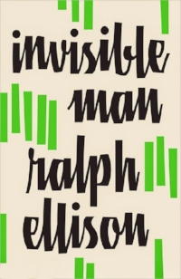
To me this cover is generic and uninteresting, which is a shame because racism is still a problem and this is one very powerful book. Nothing about it- from the type, pattern, layout, colors, etc.- seem related in any way to the book.
I started by doing some brainstorming and sketching and jotting down words and phrases which capture the mood and themes of the book.

I wanted to use a bold picture, and the most obvious solution for a photograph choice was a floating hat, glasses, or clothes or a dotted body outline or something similar, but I wanted to convey feeling rather than show something literal. After looking around for inspiration online, I found a picture of a sculpture by Bruno Catalano which seemed just right- the figure looks strong despite the giant gap in his body. I placed the title in a dark purple circle over the figure's chest because I wanted it to feel heavy like a burden. I edited the image in Photoshop to remove trees and other elements in the background, and used Illustrator to play with fonts, colors, and layout, resulting in the design below.

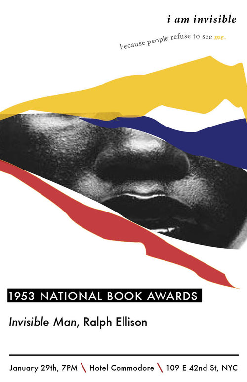
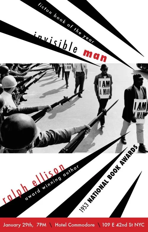
I designed 2 commemorative posters for the 1932 National Book Awards where Invisible Man author Ralph Ellison accepted an award for Fiction Book of the Year.
Below are the final versions of the 2 posters I designed. I like the first more because it is cleaner and simpler with more space. Still the second design presented many design challenges around typography and space, and I spent a longer time on it with more iterations so it was a good learning experience.